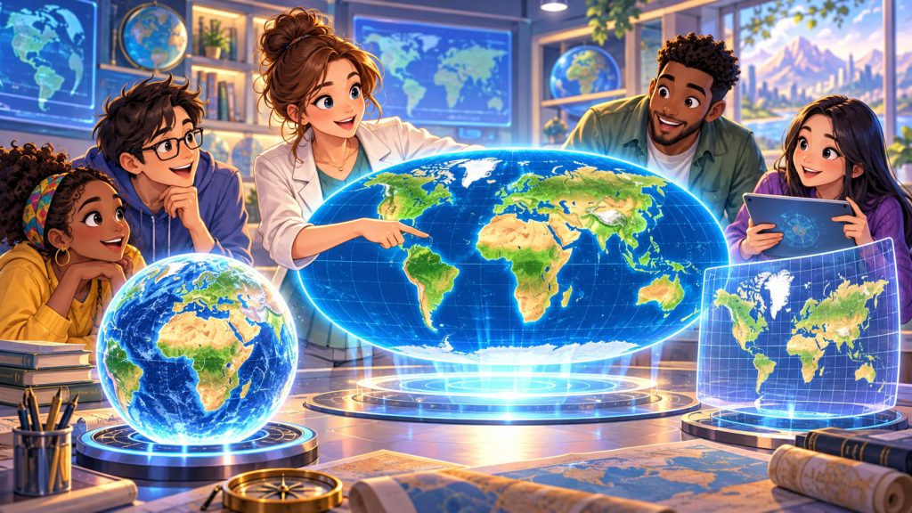
For centuries, people have relied on world maps to understand geography, explore continents, and compare countries. Yet one surprising fact often goes unnoticed: many familiar maps dramatically distort the actual sizes of Earth’s landmasses.
Greenland can appear almost as large as Africa, even though Africa is approximately 14 times larger.
This happens because representing a spherical planet on a flat surface inevitably introduces distortions.
In 2018, cartographers introduced an innovative solution called the Equal Earth projection.
The Equal Earth map preserves the true relative surface areas of countries and continents while maintaining a visually balanced, recognizable representation of our planet.
Its development represents an important achievement in modern cartography, offering a more accurate way to understand the geographical proportions of the world.
What Is the Equal Earth Projection?
The Equal Earth projection is a modern map projection designed to represent Earth’s surface on a flat map.
It belongs to a category known as equal-area projections.
These projections preserve the proportional areas of geographical regions.
This means that if one country occupies twice the surface area of another, it will also occupy twice the area on the map.
The Equal Earth projection was developed by cartographers Bojan Šavrič, Tom Patterson, and Bernhard Jenny.
Their work was introduced in 2018.
The objective was to combine accurate area representation with an attractive geographical appearance.
Unlike many conventional world maps, Equal Earth allows viewers to compare the relative sizes of countries and continents without systematic area exaggeration.
Why Traditional World Maps Can Be Misleading
One of the world’s most recognizable map designs is the Mercator projection.
Created by Gerardus Mercator in 1569, it became particularly valuable for marine navigation.
Its main advantage is that it preserves local angles, making constant compass bearings appear as straight lines.
However, this property comes with an important disadvantage.
The Mercator projection dramatically enlarges regions at high latitudes.
For example:
- Greenland appears vastly larger than its actual relative size.
- Antarctica becomes enormously stretched.
- Northern countries appear disproportionately large.
- Equatorial regions appear comparatively smaller.
These distortions increase toward the poles.
The problem is not that the Mercator projection is mathematically incorrect. It was designed for a different purpose.
A map optimized for navigation is not necessarily suitable for comparing geographical areas.
How Equal Earth Corrects Geographical Distortion
Every flat map involves some form of distortion because Earth’s curved surface cannot be flattened perfectly.
Mapmakers must decide which geographical properties to preserve.
The Equal Earth projection prioritizes surface area.
It uses mathematical transformations to distribute Earth’s geographical features across a flat plane without changing their proportional areas.
As a result, continents retain appropriate relative sizes.
Africa no longer appears artificially small compared with Greenland.
South America and Australia also become easier to compare with northern landmasses.
However, Equal Earth does not perfectly preserve every geographical property.
Shapes, angles, distances, and directions can still change.
Its greatest strength is accurate area comparison, not the complete elimination of map distortion.
The Mathematics Behind Equal Earth
Equal Earth is classified as a pseudocylindrical projection.
In this family of projections, lines of latitude are represented as straight, parallel horizontal lines, while most lines of longitude are curved.
The central meridian remains straight.
Equal Earth uses carefully designed mathematical equations to determine the position of geographical features.
These equations preserve area while producing a balanced outline of the continents.
The resulting map has gently curved outer boundaries and a recognizable arrangement of landmasses.
Unlike some equal-area maps that severely stretch geographical shapes, Equal Earth was designed to maintain a relatively natural appearance.
This makes it useful for education, scientific communication, and general-purpose world mapping.
How Equal Earth Compares With the Robinson Projection
The Robinson projection, introduced in 1963, became popular because of its visually pleasing representation of the world.
It balances different types of distortion rather than perfectly preserving a single property.
Its continents have familiar shapes, and its curved boundaries create a harmonious appearance.
However, Robinson is not an equal-area projection.
The Equal Earth designers drew inspiration from its overall visual style.
They developed a projection that offers similar aesthetic qualities while preserving proportional land areas.
The result combines two important advantages:
- Reliable comparisons of geographical area
- An attractive, familiar world-map appearance
This balance helps explain why Equal Earth is useful for communicating geographical information to broad audiences.
Why Greenland and Africa Look So Different
The comparison between Greenland and Africa is one of the clearest demonstrations of map distortion.
Africa covers approximately 30.3 million square kilometers.
Greenland covers approximately 2.17 million square kilometers.
Africa is therefore roughly 14 times larger.
On many Mercator maps, however, Greenland looks comparable in size to Africa.
Equal Earth corrects this misleading impression.
It displays the two landmasses with their proper proportional areas.
The same principle applies to comparisons between Europe and South America or between northern Asia and tropical regions.
Equal Earth reveals geographical relationships that conventional maps can visually obscure.
Why Equal Earth Matters for Education
Maps strongly influence how people imagine the world.
Students often develop their understanding of continental size, geographical distance, and global relationships through classroom maps.
When those maps exaggerate certain regions, they can create persistent misconceptions.
Equal Earth offers an alternative that emphasizes actual land-area proportions.
It is particularly helpful when teaching students about:
- Continental geography
- Population distribution
- Environmental change
- Natural resources
- Global land use
A properly chosen map can improve geographical literacy by matching its visual properties to the information being taught.
Equal Earth in Climate and Environmental Science
Scientists frequently use maps to illustrate global environmental patterns.
These include deforestation, agricultural land, desertification, and ecosystem distribution.
Equal Earth can be valuable for thematic maps, which use colors or symbols to display particular characteristics of geographical regions.
Because surface areas remain proportional, regions do not appear artificially enlarged simply because they are located near the poles.
For example, a global land-cover map can display forested and agricultural areas without the systematic area inflation found in Mercator maps.
However, scientific interpretation still requires carefully chosen data, colors, and map scales.
An equal-area map does not automatically make the underlying information accurate.
Expert Perspective: Why Map Design Matters
Cartographer Bernhard Jenny, one of the Equal Earth projection’s developers, has worked extensively on understanding and improving map projections.
The Equal Earth design reflects a central principle of professional cartography: the best map projection depends on what the map is intended to communicate.
Preserving geographical area is especially important when maps compare regions, environmental resources, or global distributions.
Other applications, including navigation and detailed local mapping, may benefit from different projections.
Equal Earth demonstrates how mathematical accuracy and visual design can work together.
Can Equal Earth Replace Every Other World Map?
Despite its advantages, Equal Earth is not suitable for every geographical task.
A map used for marine navigation has different requirements from one showing global forest coverage.
Likewise, calculating precise distances between cities requires appropriate geographical methods rather than relying on measurements taken directly from a world map.
Modern geographic information systems (GIS) allow cartographers to select projections according to specific analytical goals.
Equal Earth is particularly effective for global maps where surface-area comparison is important.
Its development highlights a fundamental truth about cartography.
No flat world map can preserve every property of Earth’s surface simultaneously. The most accurate map is the one that preserves the properties relevant to its purpose.
Interesting Facts
- The Equal Earth projection was introduced in 2018.
- Its three developers are Bojan Šavrič, Tom Patterson, and Bernhard Jenny.
- Equal Earth preserves the proportional surface areas of geographical regions.
- Africa is approximately 14 times larger than Greenland, despite their misleading appearance on many Mercator maps.
- The Mercator projection dates back to 1569.
- Equal Earth’s visual design was partly inspired by the Robinson projection.
- No flat map can simultaneously preserve all distances, directions, angles, and areas across the entire globe.
- Equal-area projections are particularly useful for maps showing global land use, vegetation, and environmental distributions.
Glossary
- Map Projection — A mathematical method for representing Earth’s curved surface on a flat map.
- Equal-Area Projection — A map projection that preserves the proportional surface areas of geographical regions.
- Mercator Projection — A cylindrical map projection introduced in 1569 that preserves local angles but strongly exaggerates areas toward the poles.
- Distortion — A change in geographical size, shape, distance, or direction caused by converting Earth’s curved surface into a flat map.
- Pseudocylindrical Projection — A map projection with straight, parallel latitude lines and generally curved longitude lines.
- Robinson Projection — A world-map projection designed to balance different forms of distortion and produce a visually appealing representation.
- Thematic Map — A map designed to display specific geographical information, such as climate, population, vegetation, or land use.
- Geographic Information Systems (GIS) — Computer-based systems used to collect, analyze, manage, and visualize geographical data.